
New ICAI CA Logo: Know the Guidelines of Usage
New ICAI CA Logo – ICAI CA Logo – ICAI – CA – CA Logo – Know the Guidelines of Usage – taxscan
New ICAI CA Logo – ICAI CA Logo – ICAI – CA – CA Logo – Know the Guidelines of Usage – taxscan
The Institute of Chartered Accountants of India (ICAI) had earlier released a new logo for Chartered Accountants (CAs) in the Global Professional Accountants Convention (GloPAC).
Incorporating the tricolor into CA India's new logo symbolizes unity, diversity, and sovereignty, reflecting the brand's commitment to India's development. The dynamic arrangement hints at motion, portraying a journey towards progress and showcasing the Institute's forward-thinking approach.
The significance of the primary blue color, derived from the ICAI logo, lies in its association with divinity, immortality, bravery, and determination. Representing vastness as the color of the sky and ocean, blue has deep roots in Indian culture for over 5,000 years, making it a culturally significant choice.
The adaptability of the new logo across digital and analog platforms is crucial for a modern brand. This versatility ensures consistent brand representation, strengthening identity and credibility. Moreover, it enhances accessibility for stakeholders, including members, students, and the general public.
In essence, CA India's new logo retains its identity while embodying a strong connection to India. The tricolor incorporation, significance of blue, and adaptability on all platforms converge to create a visually pleasing and culturally significant design, reflecting the Institute's values and commitment to serving the nation.
The following guidelines of usage are advised to the members of the Institute for adhering to the code of respect towards the newly launched logo: –
Colour Palette of new logo:
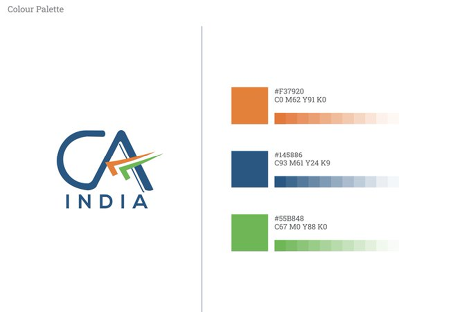
The logo consists of the letters 'CA' in blue color with a tri-color tick mark (upside down) with white background. The blue color not only stands out on any background but also denotes creativity, innovativeness, knowledge, integrity, trust, truth, stability, and depth. The upside-down tick mark, typically used by Chartered Accountants, has been included to symbolize the wisdom and value of the professional.
'India' is also added in the logo, as it epitomizes the Institute's connection to India First approach and commitment to serve the Indian economy in public interest.
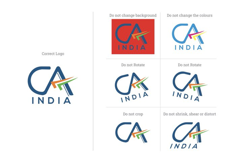
- There should be no alteration of the font (color, bold/unbold, size). Moreover, there should be no change in spacing and dimensions.
- Do not change the design and colors including the white background.
- Refrain from rotating or tilting the logo clockwise and anti-clockwise.
- The logo should not be shrunk or distorted changing the original proportion.
- While members are encouraged to use the new CA India Logo as published on letterheads, visiting cards, website etc, a transition time of one year has been provided to use existing stationary/signage replacement etc.
The following image shows the correct design of the new logo, and what not to do while using the logo:
On a different note, the Institute of Chartered Accountants of India (ICAI) had sent a legal notice to a proprietor for alleged use of the old CA logo, in shoe branding.
It is informed that the CA Logo containing the letters ‘CA‘ is the registered Trade Mark of this Institute (Registration no. 2147610) and any unauthorized use of the same or its constituent letters amounts to the infringement of Trade Mark of the Institute which is a punishable offense under the Trade Marks Act, 1999. It is stated that by unauthorizedly using the CA Logo, committed the offense specified under the Trade Marks Act, 1999 relating to the infringement of Trade Mark.
Support our journalism by subscribing to Taxscan premium. Follow us on Telegram for quick updates
